Every problem requires a solution. My problem was creating my own brand identity. My solution was to make an identity that showed personality, creativity, professionalism and skill.
What is my personality and how do I translate that into a visual image that is conveyed to the client? This isn't a question I normally think about on a daily basis and is difficult to answer. I decided that my name was the best way to start my journey to creating a brand Identity logo or wordmark.
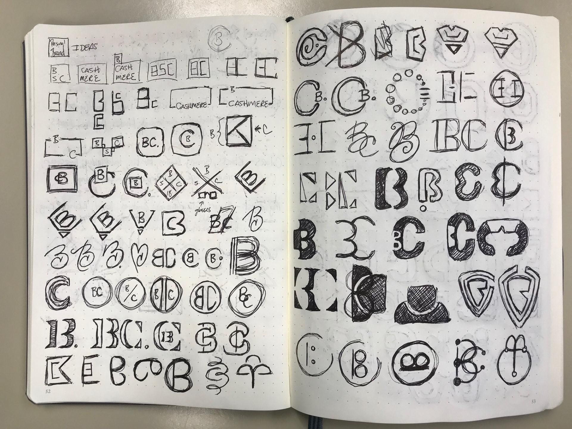
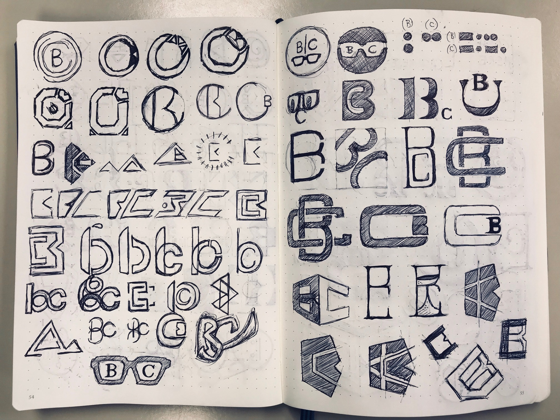
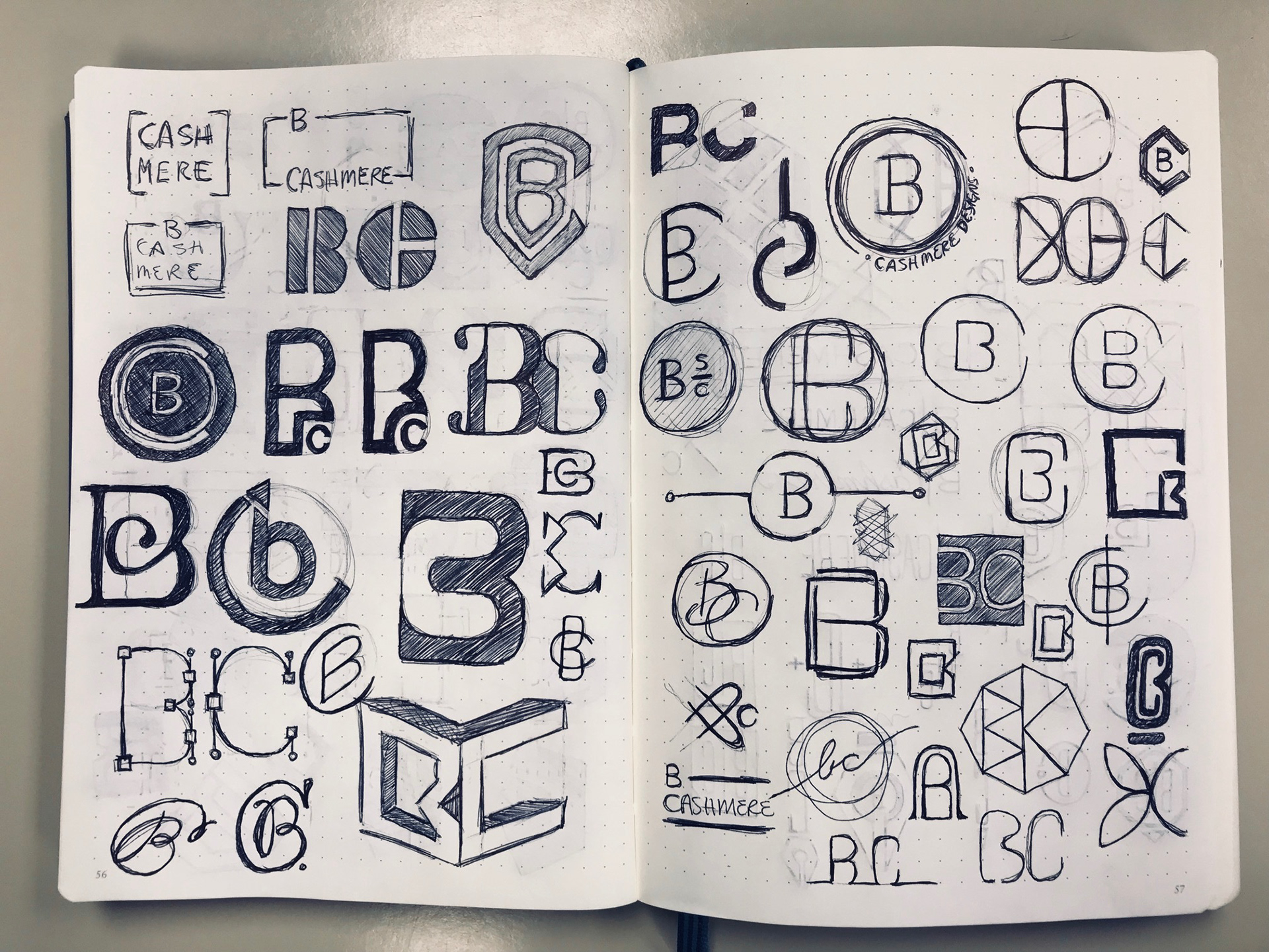
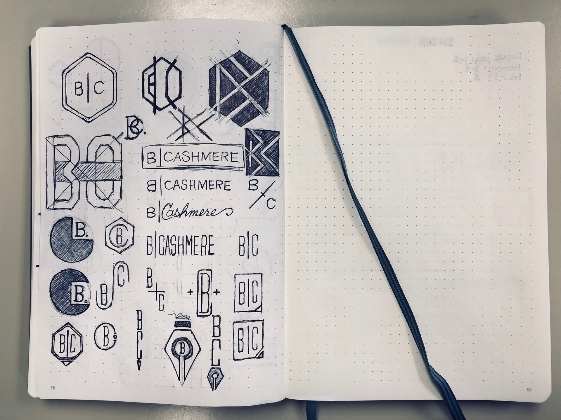
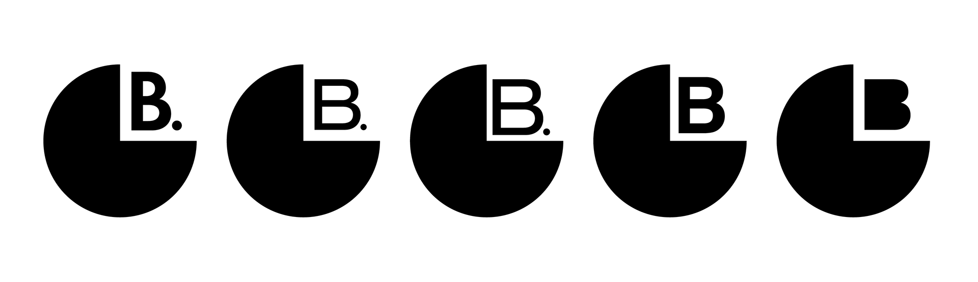
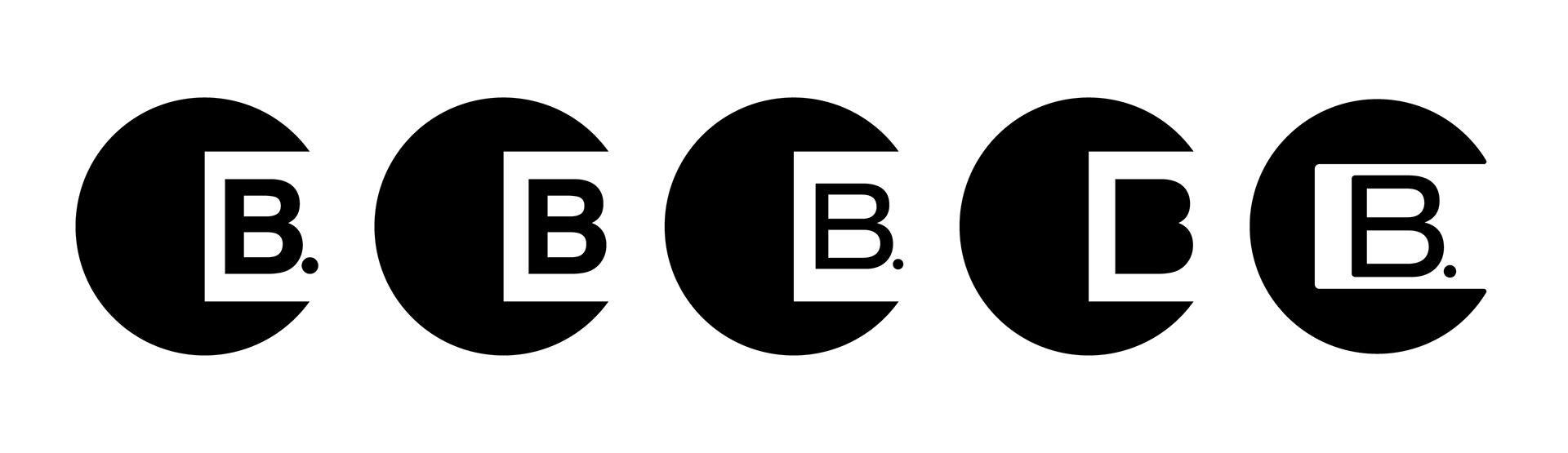
Once the sketching process was done the designed needed to be narrowed down to a few the really captured my personality. The idea was to be minimalistic, approachable, personable and professional.
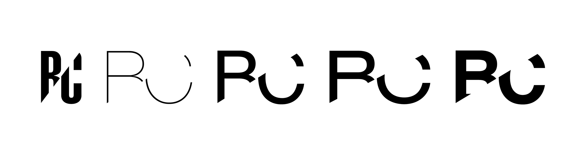

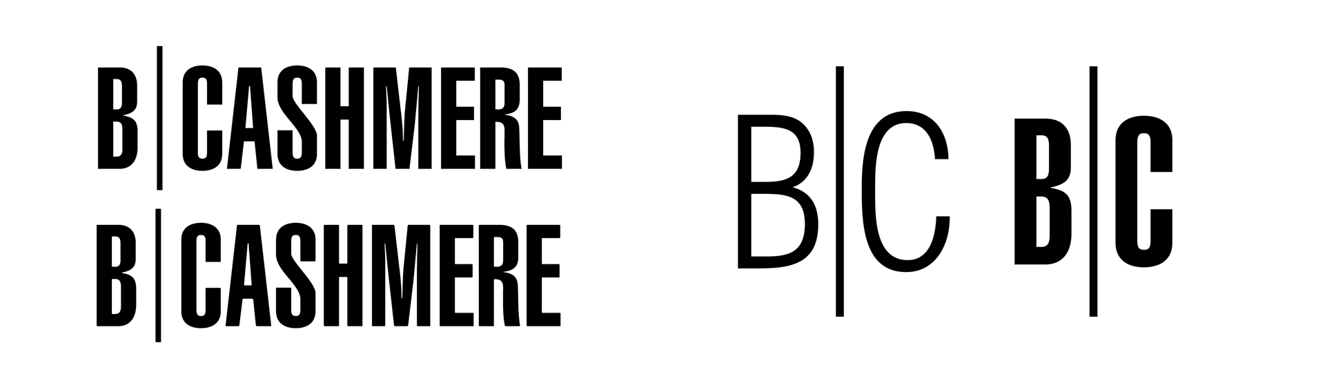
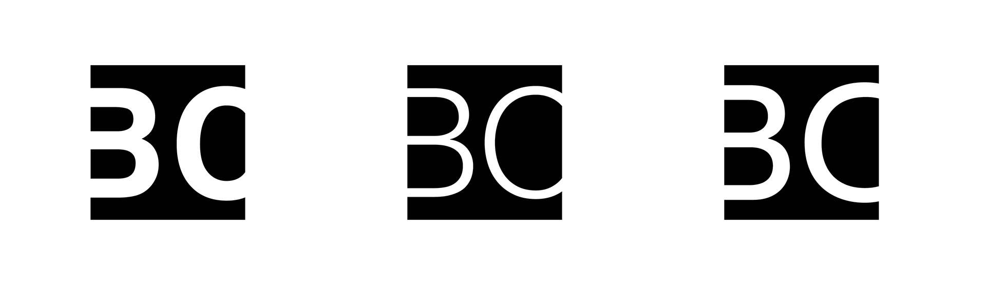
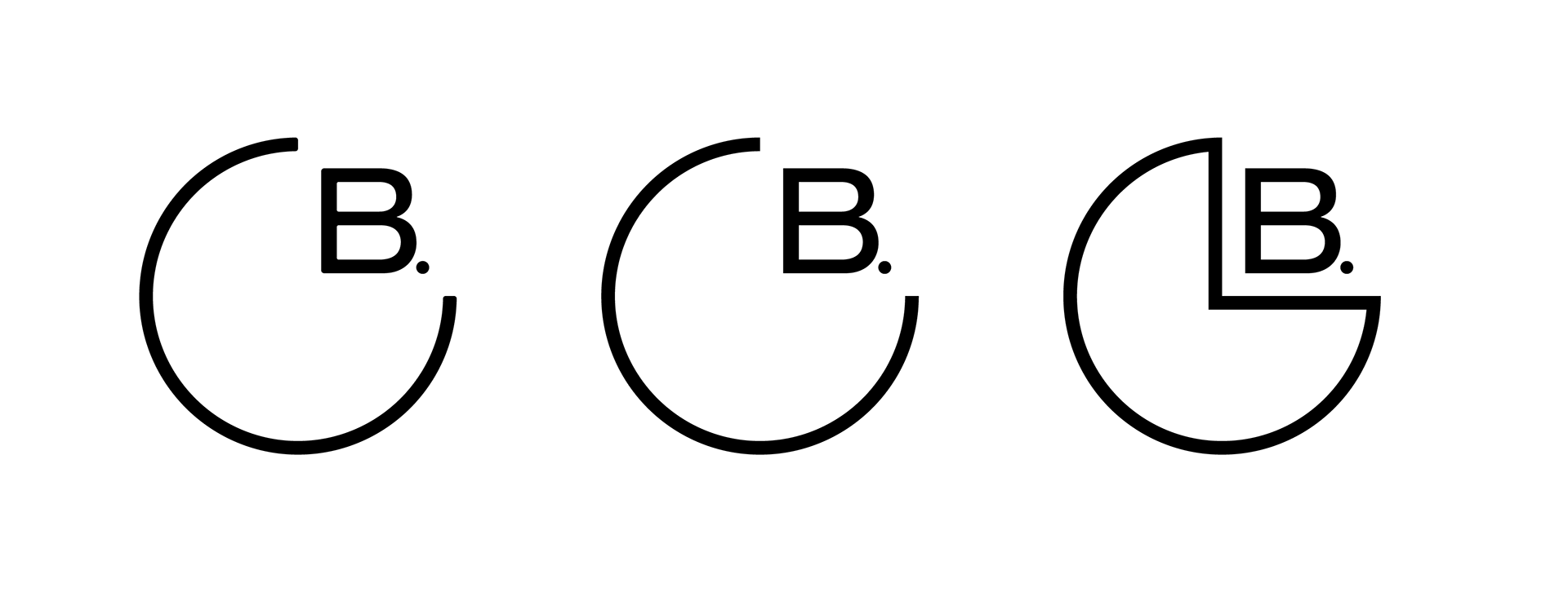
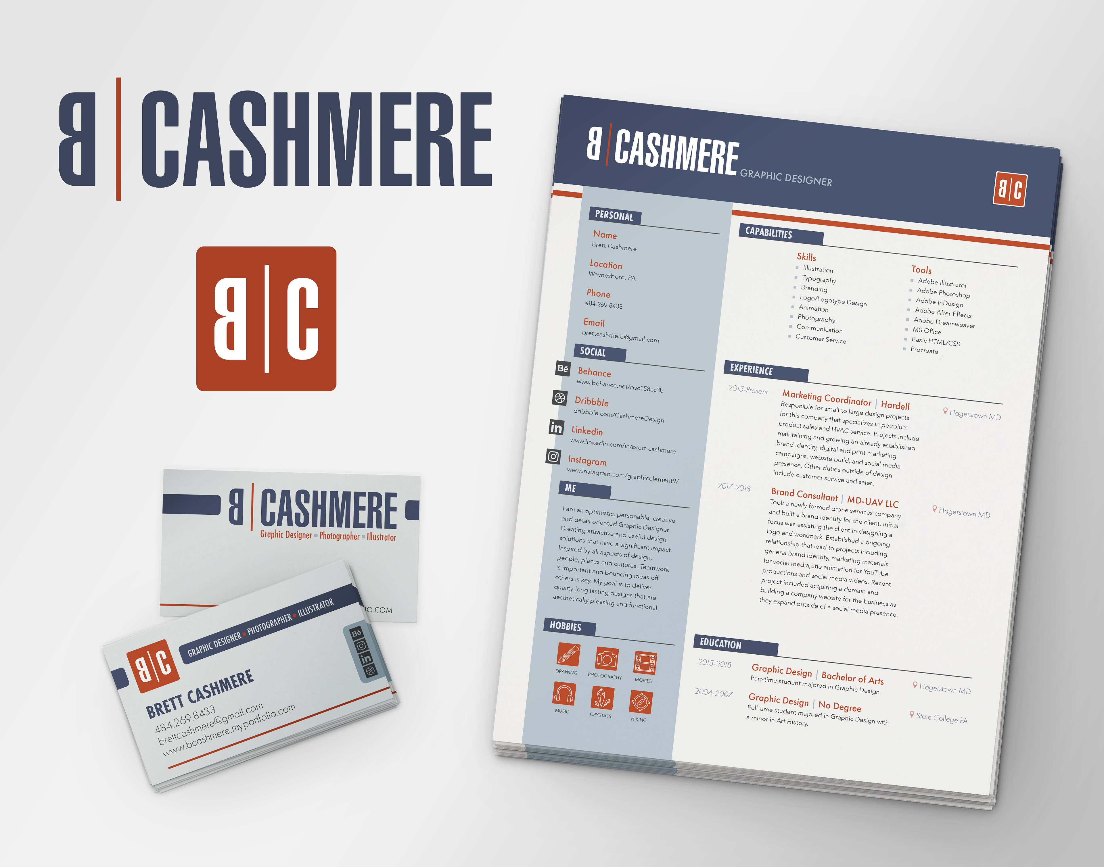
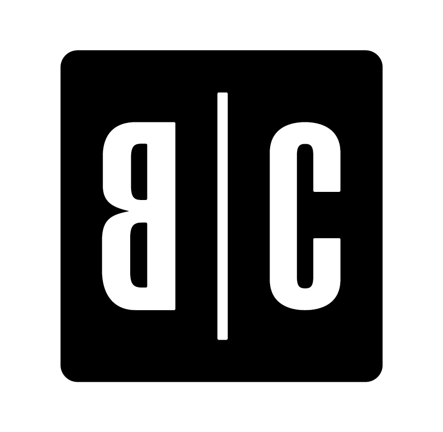
We have had a winner or should I say winners. The choice was to create both a workmark and monogram logo to be used used in different situation or in conjunction was needed. The final design concept gives the brand a modern feel with sightly rounded corners for a human approachable touch along with a quirky backwards B to add personality to the brand logo.

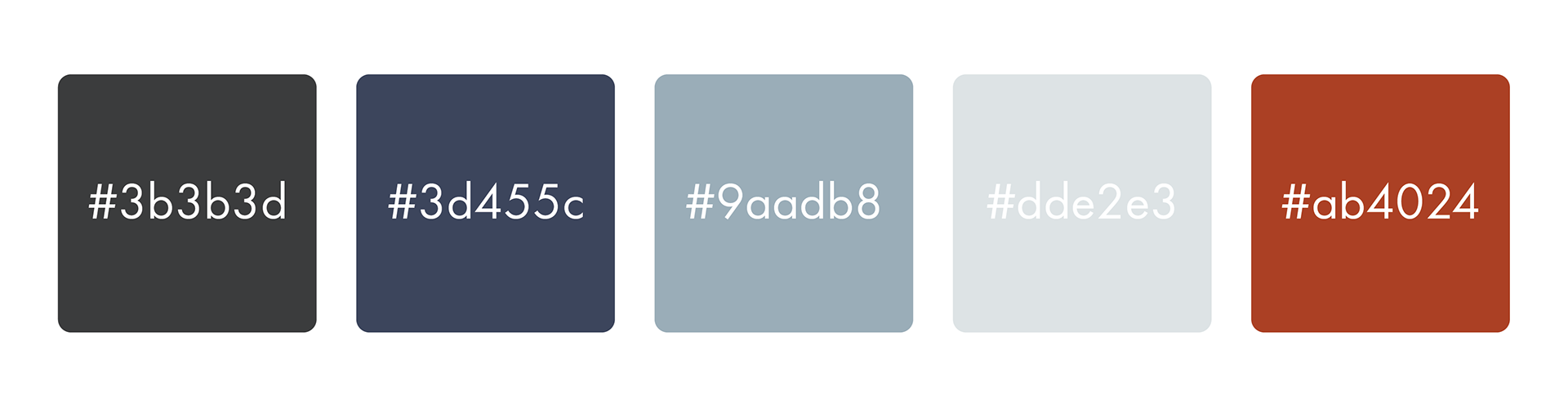
Adding a little color to the situation was the most challenging part for me because I wanted complementary colors but needed them to be correct so that they did not vibrate to much with each other. At the start I went with more vibrant shades of oranges and blues but quickly realized this was not going to work. The end results were more professional shades of gray-blue and burnt orange. The orange portraying a warm friendly energy while the blues balance that with a relaxing professional feel.
Finalized brand elements pulling the identity together with slightly rounded edge shape elements, a minimal clean aesthetic and linear San Serif type.